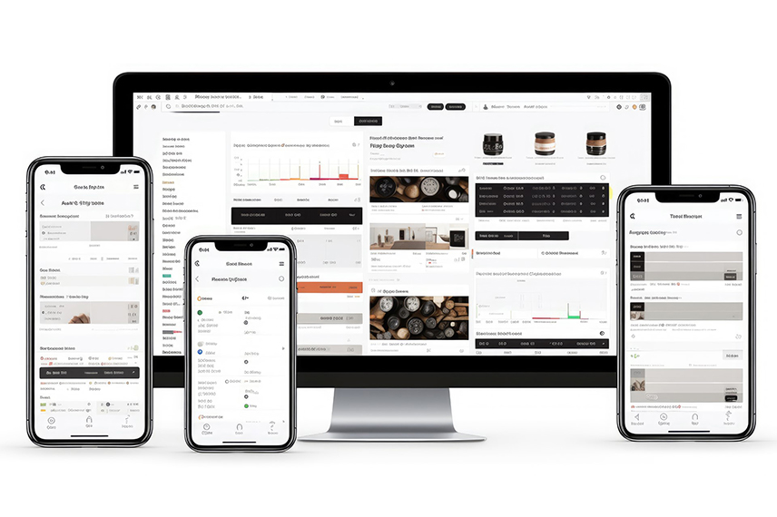
In today's digital landscape, where users access websites and web applications across a myriad of devices, ensuring cross-device compatibility is paramount. Responsive web design has emerged as the solution to this challenge, offering a seamless user experience regardless of the device's screen size or orientation. In this blog, we'll explore the concept of responsive web design and delve into the strategies and best practices that guarantee cross-device compatibility for your web app.
The Significance of Responsive Web Design
Responsive web design is a design approach that prioritizes the creation of websites and web applications that automatically adapt to the user's device. Whether your audience is using a desktop computer, laptop, tablet, or smartphone, responsive design ensures that your web app looks and functions impeccably on all devices.
Key Principles of Responsive Web Design
Fluid Grid Layouts:
Implement flexible grid layouts that automatically adjust to fit the screen size. Grid systems, such as CSS Grid or Flexbox, allow for fluidity and consistency in design.
Media Queries:
Utilize media queries in your CSS to detect the device's screen size and apply appropriate styles accordingly. Media queries enable you to create breakpoints for different devices.
Flexible Images and Media:
Use CSS to ensure that images and media content scale appropriately with the screen size. This prevents images from being too large or too small on different devices.
Mobile-First Approach:
Start designing with mobile devices in mind. This approach ensures that your web app is optimized for smaller screens and progressively enhances the design for larger devices.
Content Prioritization:
Prioritize essential content and features for mobile users. This ensures that users on smaller screens can access critical information without excessive scrolling.
Touch-Friendly Interactions:
Optimize interactive elements for touchscreens, such as larger buttons and touch-friendly navigation menus for mobile users.
Accessibility
Ensure that the app is accessible to all users, including those with disabilities. Adhering to accessibility guidelines enhances inclusivity and widens your app's user base.
The Benefits of Responsive Web Design
Improved User Experience:
Responsive web design provides a consistent and user-friendly experience across all devices, reducing bounce rates and enhancing user satisfaction.
Better SEO Performance:
Google and other search engines prioritize mobile-friendly websites in search results. Responsive design can boost your search engine rankings.
Cost-Effective:
Developing a single responsive web app is more cost-effective than building separate apps for different devices or platforms.
Future-Proofing:
As new devices with varying screen sizes and resolutions emerge, responsive design ensures that your web app remains adaptable and future-proof.
Conclusion
Responsive web design is not merely an option but a necessity in today's digital age. It enables web apps to reach a broader audience and provides a consistent, enjoyable user experience regardless of the device used. By implementing the principles and best practices of responsive design, you can ensure that your web app thrives in an increasingly diverse and dynamic digital landscape. Responsive design is the key to unlocking cross-device compatibility and meeting the expectations of modern web users.